NOAH’S
NURSERy
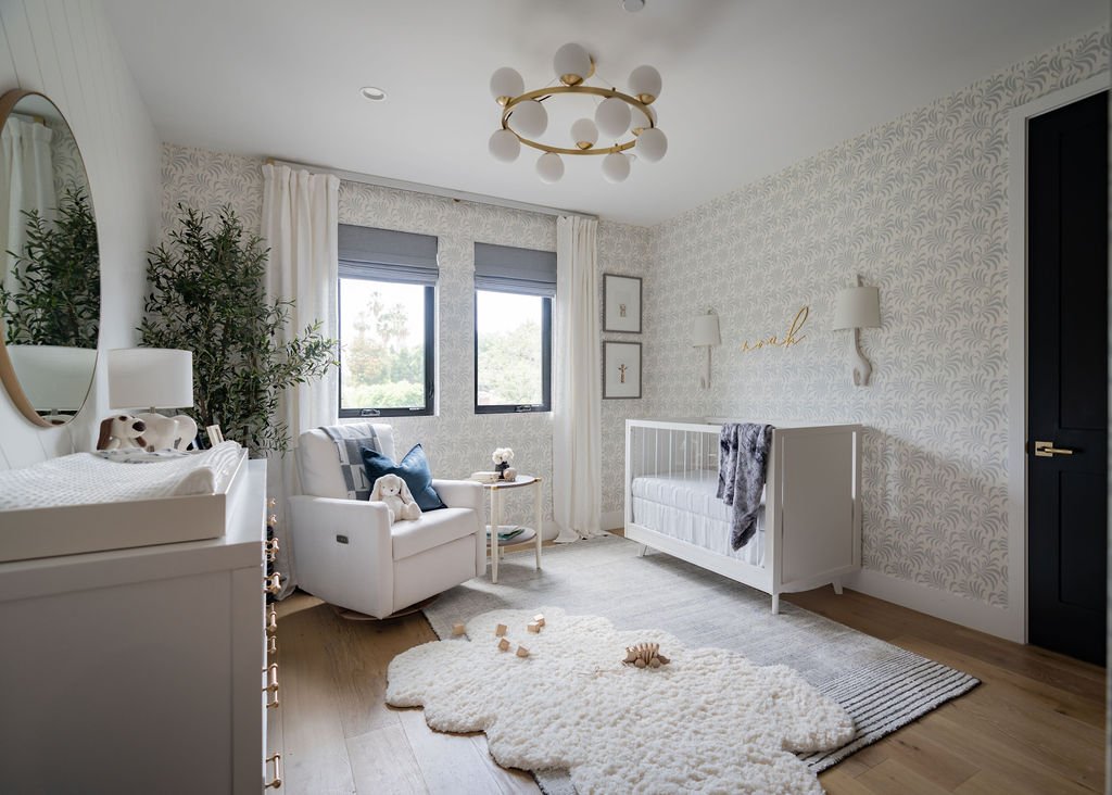
Hey again! I’ve included so many angles and detail shots of this room because there are countless details to talk about and I didn’t want you to miss a thing! This client knew that she wanted a bright, airy concept. As a first time mom-to-be and knowing they were planning on more kids, they were looking for a neutral concept that could eventually transition to a room for baby number two whether they had a boy or girl. I presented her with several concepts and ultimately they fell in love with the idea of this all-over white and neutral palette– a serene space wrapped in the softest shade of grey. It’s really one of the most versatile color combos and a true classic that works beautifully for a gender neutral space.
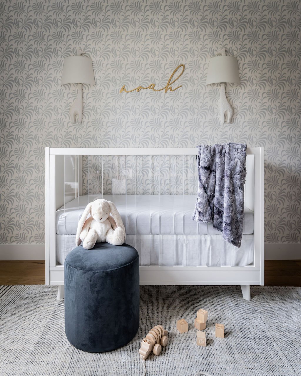
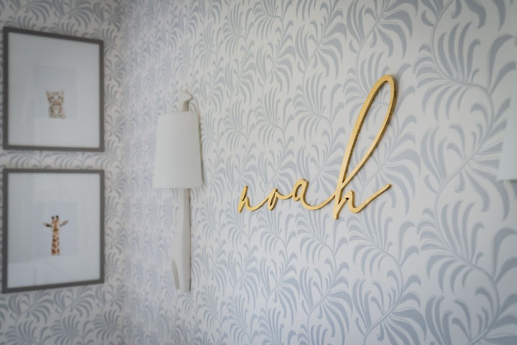
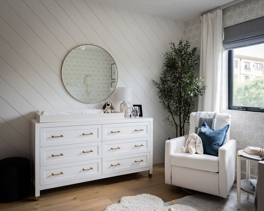
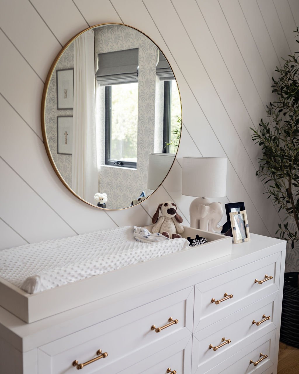
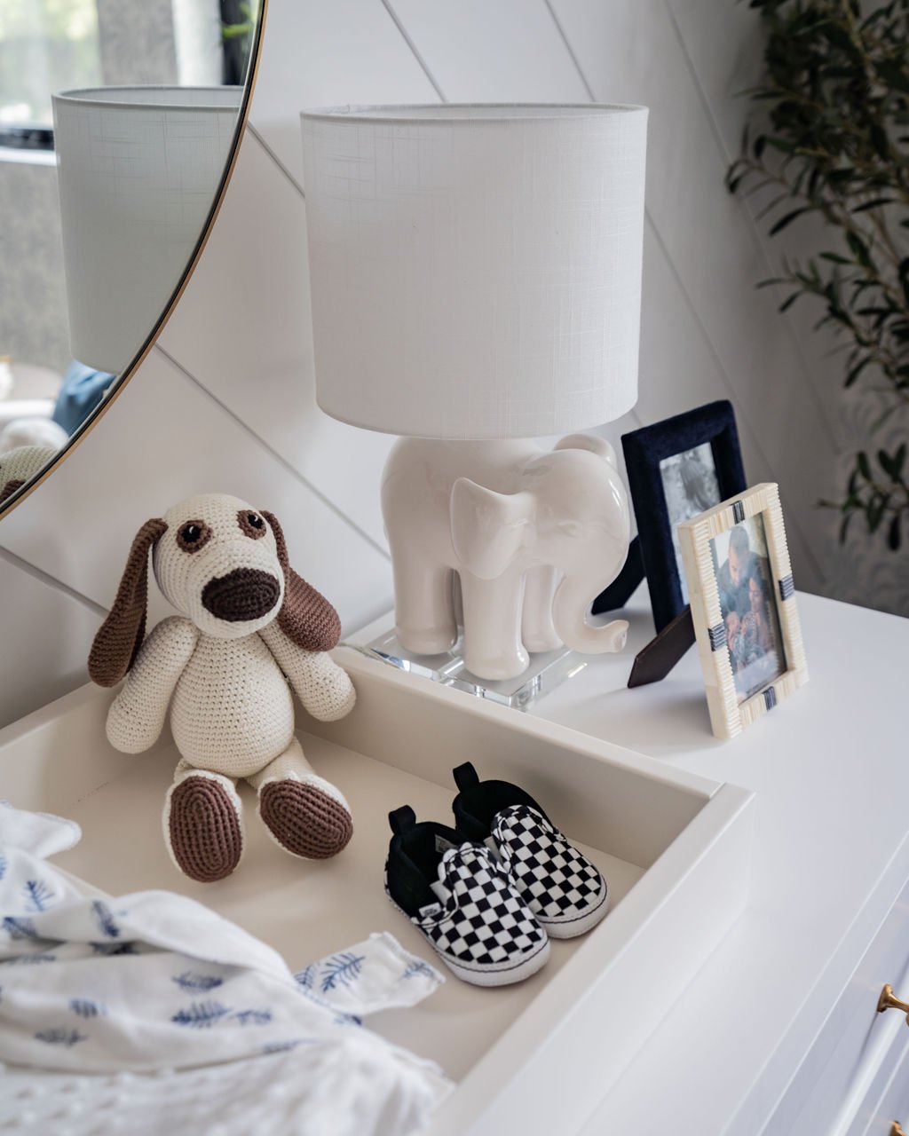
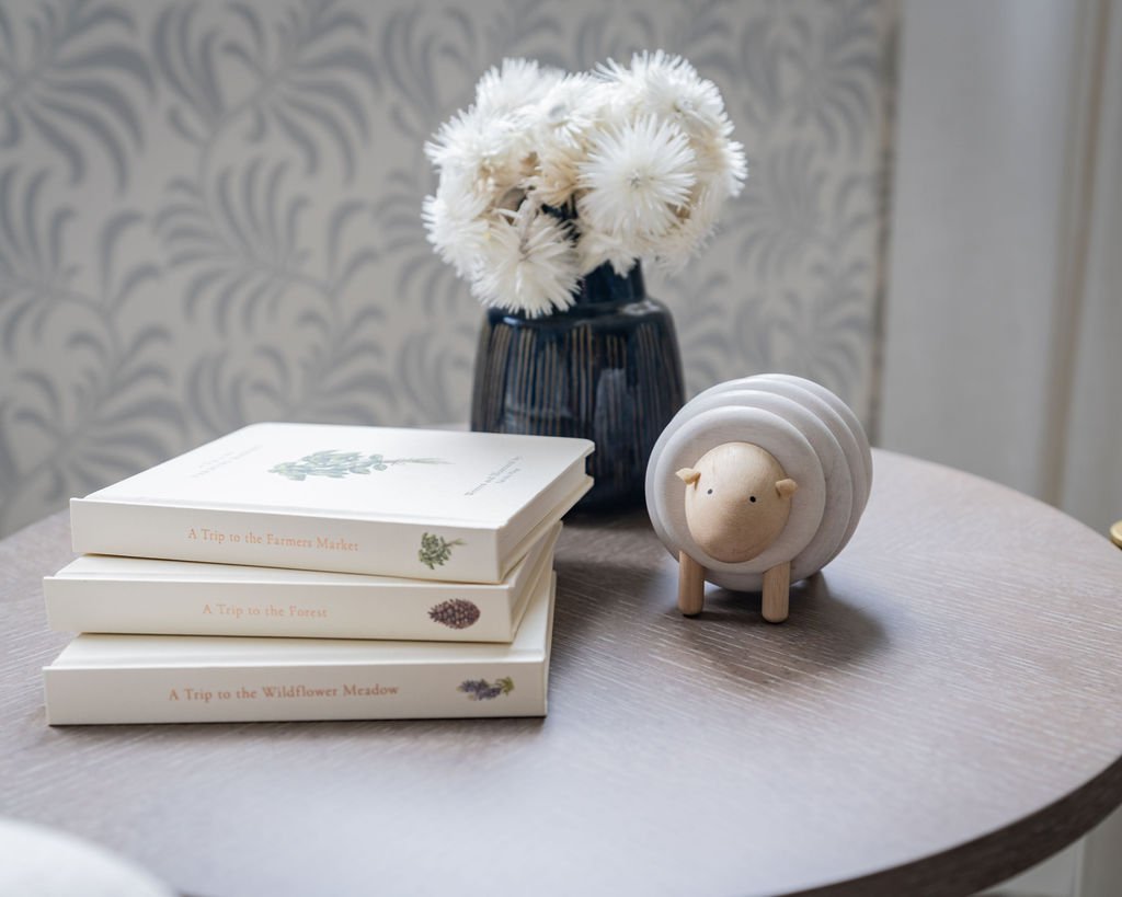
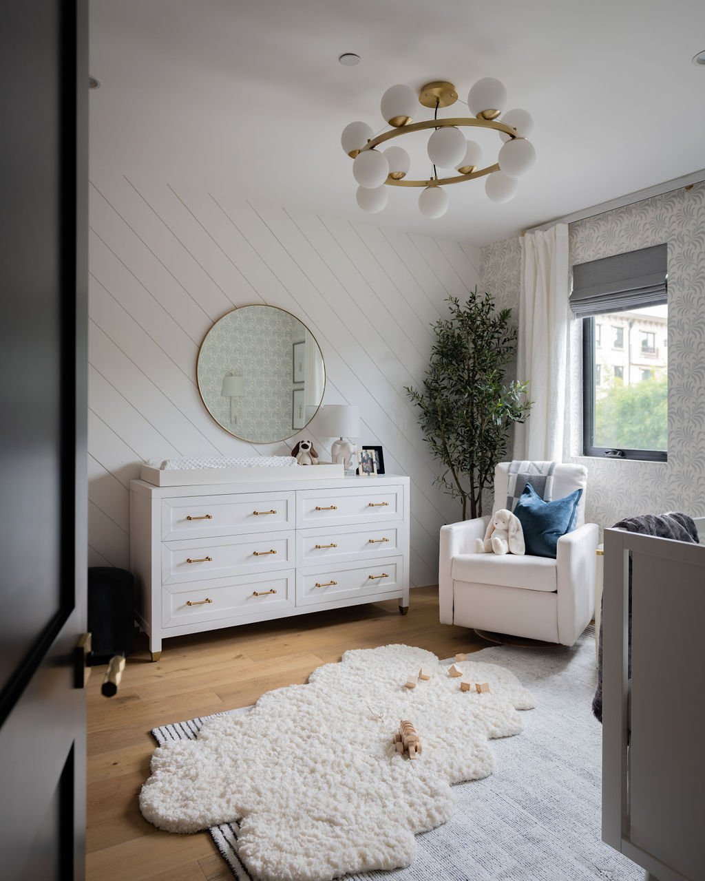
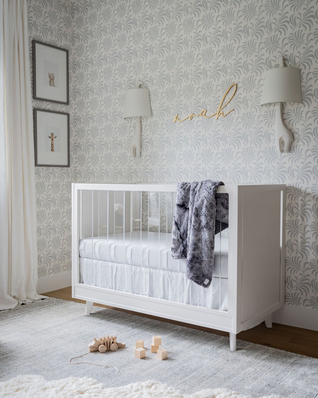
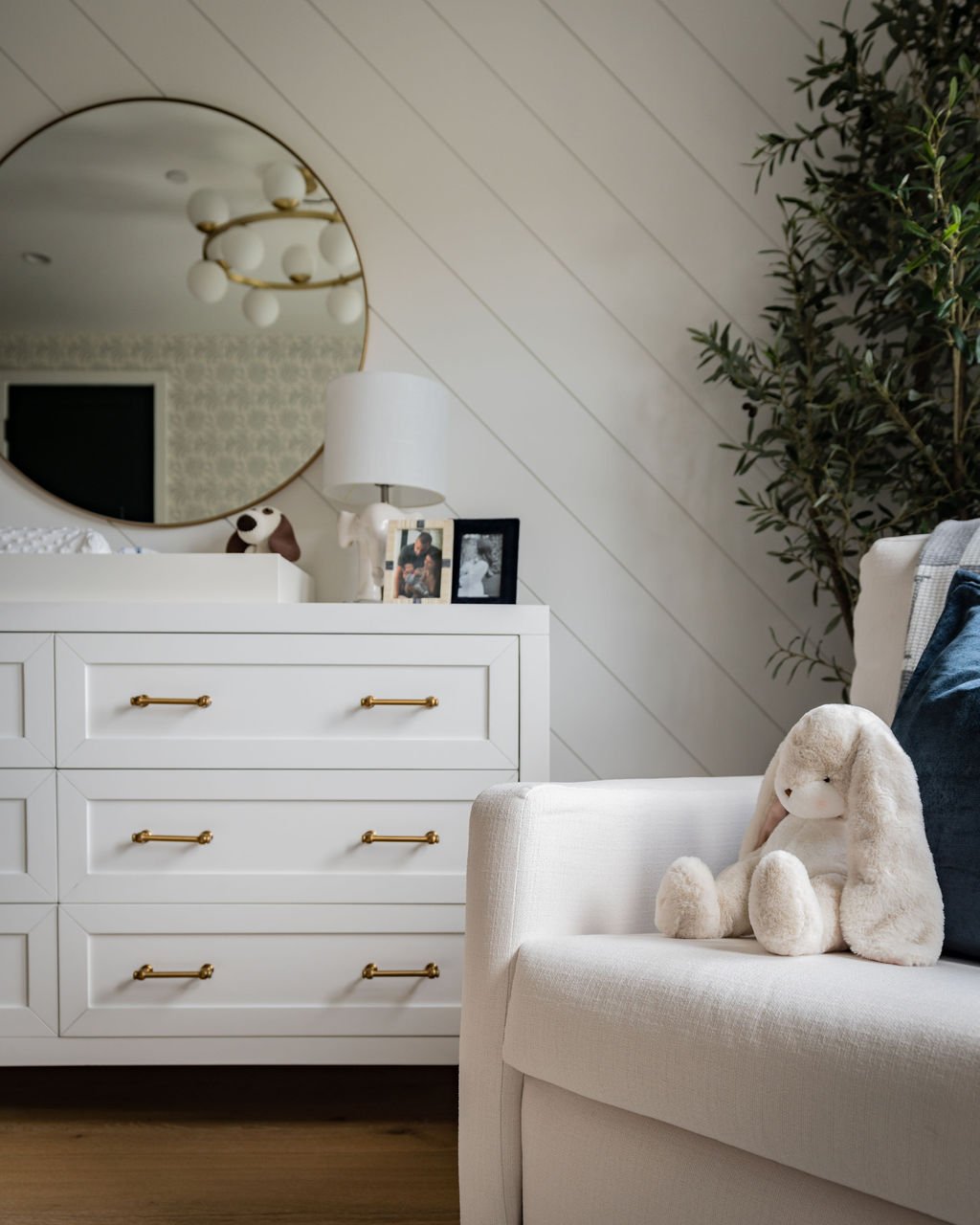
A neutral and modern concept with just enough playful details for baby to feel cozy and welcome. The room shines with personality through a patterned wallpaper in a leafy vine motif from Serena & Lily. My client absolutely loved this pattern when she saw the sample in person and honestly, I think this was one of the first decisions made. It’s a great companion to the eye-catching diagonal shiplap wall. Adding whimsical accents like the baby animal art, elephant table lamp and of course the adorable giraffe wall sconces keeps the room feeling youthful.
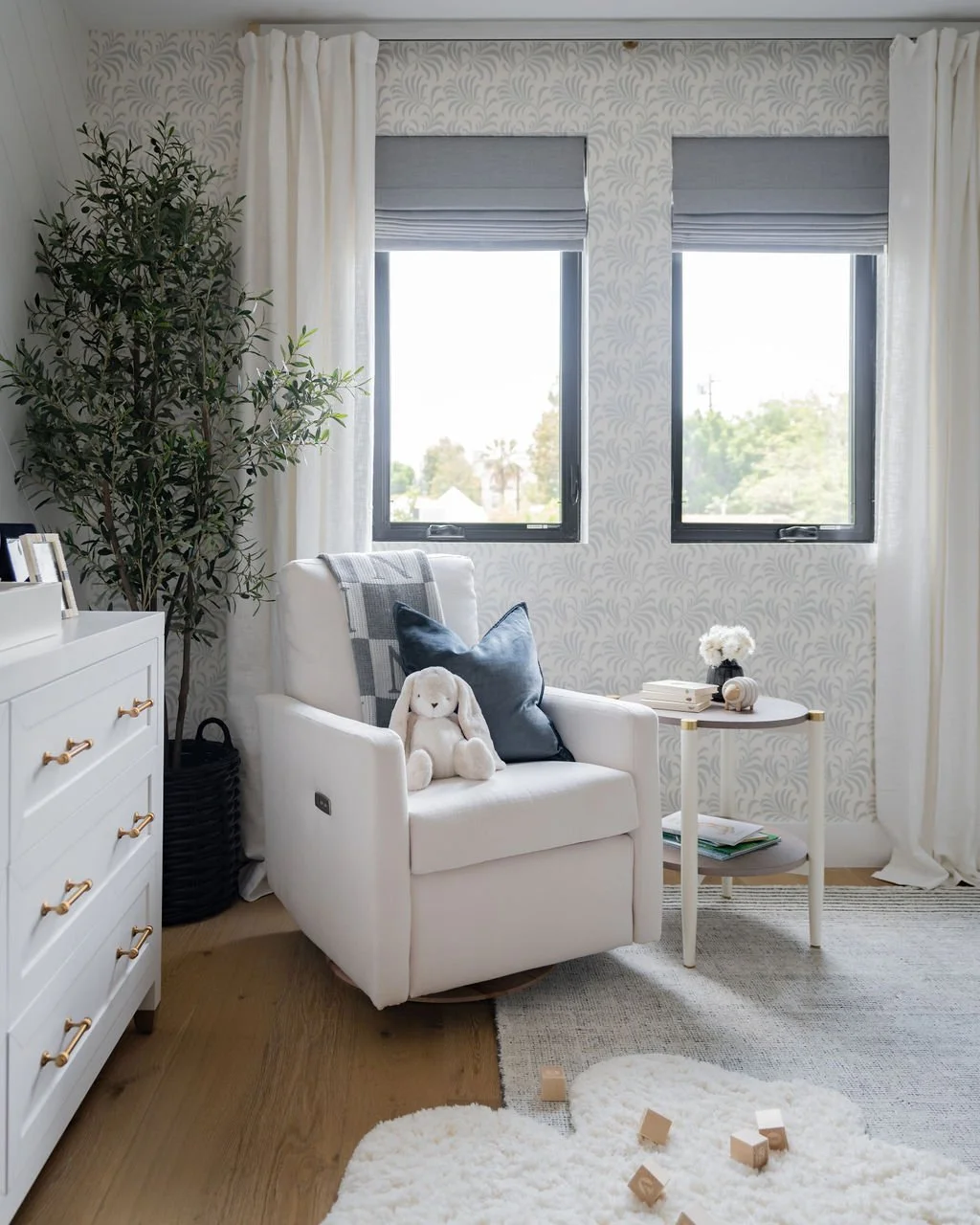
One of the most important elements in a nursery is the nursing chair. Mamas, don’t skip on being able to sit in the chair before making your purchase! Chairs come in so many different styles, sizes, arm heights, back heights and comfort levels…meaning, they are not a one-size-fits-all type of item. This is definitely a piece that you’ll want to be uber comfy! This particular glider is the Drew style from Oilo Studio. My client was able to test it out prior to placing the order and she continually raves about this chair, noting that it’s probably the most comfortable piece of furniture in their entire home! Not only does it swivel, but it also has a power reclining feature which provides the ultimate cozy spot for cuddling with baby. The style is so modern and neutral it really can work anywhere.
Facing the front of the house, this bedroom receives a flood of natural light through the small windows. An element not to be taken for granted during the day because you won’t have to rely on secondary light sources (although this room is layered with them!) but we did need to address the all-too-important need for complete darkness during nap time - cue the blackout shades! We turned to The Shade Store for their beautiful cascade roman shades in a grey textural blackout fabric. This style stacks nicely and looks great when in a completely open position. And when lowered, is also a parents’ bestie providing the darkest coverage possible. To soften the overall look, I love to layer draperies. We chose an ivory linen pair from Pottery Barn to frame the windows which can also be used for extra coverage in the event the tiniest little bit of light filters through the shades.
With the exception of the crib, I rarely shop for kids rooms at juvenile-specific stores. To create an elevated space, I turn to the same designer furnishings and fabrics that are typically used in my residential projects. For example, the wide dresser is an item regularly used in Primary bedrooms. It’s important to consider longevity when designing a kids space so that you won’t need to replace furnishings right away. This is why I recommend opting for a full-size dresser and adding a changing tray topper to use as your changing station, that is, if the space allows. The topper is removable and the dresser can stay until their teenage years and beyond. I love the gold hardware on this dresser making it stand out in the room, especially since it’s against a white wall.
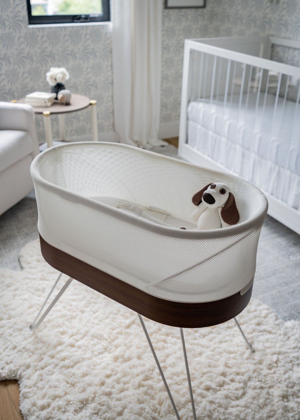
To ground the room and add additional soft surfaces, we layered two area rugs to make the floor a plush delight. Pro tip: If you don’t have the space for additional seating, this is a great way to make the room inviting for grownups as well - offering a soft surface to sit and play a while. The rectangular area rug is from West Elm and has a subtle stripe in a beautiful slate and alabaster color combo. And for that extra soft topper, we layered a faux sheepskin rug adding so much texture. This rug is not only pretty, but it’s incredibly fluffy under your feet! Bonus, it’s also vegan, which was really important to my client.
Noah’s nursery evolved into such an adorable space and I enjoyed working with this client throughout the process. This room can definitely be transitioned for years to come, and hopefully, even turn into a new nursery with just a few minor swaps and additions.

